Winter Color Palette: Colors, Subtypes, and a Practical Draping Guide
Compare Cool, Deep, and Bright Winter colors, test shades with fabric draping, and build a flexible palette for clothes and makeup.
The Winter color palette is generally cool, clear, and built around medium-to-deep colors with crisp light accents. Signature shades include black, optic white, charcoal, cool navy, cobalt, emerald, blue-red, fuchsia, vivid purple, and icy pastels.
To explore whether Winter suits you, compare fabrics beside your face in consistent indirect daylight rather than deciding from hair, eye, or vein color. Notice subjective differences in complexion appearance, feature definition, and the visual balance between your face and the fabric. Repeated observations may suggest Cool Winter, Deep Winter, Bright Winter, or a neighboring season.
Seasonal color analysis is a styling framework, not an objective measurement of attractiveness. You can enjoy and wear colors outside any tentative classification. The goal is to identify patterns that make wardrobe decisions easier, not to impose rules on personal style.
The Winter palette at a glance
Three color qualities help explain what makes a shade feel “Winter”:
- Temperature: its warm-to-cool character. Blue-red looks cooler than an orange-leaning tomato red.
- Value: its lightness or depth. Icy blue has a light value, while navy has a deep value.
- Chroma: its intensity or clarity rather than mutedness. Cobalt looks clearer than gray-softened denim blue. Here, the color term helps describe visible differences between fabrics. It does not scientifically validate seasonal categories.
Winter palettes usually combine cool temperature with clear colors and substantial depth. Their light shades tend to be icy rather than dusty. Think of a faint, clean blue against white rather than a softened blue-gray.
Black, white, and gray anchor the palette even though these achromatic neutrals do not have the high chroma of its vivid accents.
A practical Winter starter palette
Use these families as a shopping reference, not a requirement to own every shade.
| Color family | Starting shades |
|---|---|
| Neutrals | Black, optic white, charcoal |
| Neutrals | Cool gray, cool navy |
| Blues and greens | Cobalt, sapphire, royal blue |
| Blues and greens | Blue-based teal, emerald, pine green |
| Reds and pinks | Blue-red, cranberry, raspberry |
| Reds and pinks | Fuchsia, magenta, cool burgundy |
| Purples | Amethyst, royal purple, blue-violet |
| Icy accents | Icy pink, icy blue |
| Icy accents | Icy lavender, icy mint |
Shade names are not standardized. One retailer’s emerald may lean yellow, while another’s may look distinctly blue-green. Screens, fabric finishes, and dye lots also change what you see. Prioritize the visible qualities of the garment over its label.
Cool, Deep, and Bright Winter compared
In common twelve-season systems, Winter divides into three subtypes according to the quality that has the strongest visual effect: coolness, depth, or clarity. Names and boundaries vary between systems.
| Subtype | Dominant dimension | Strongest neutrals | Representative accent colors | Closest neighboring season |
|---|---|---|---|---|
| Cool / True Winter | Cool temperature | Blue-charcoal, cool navy, optic white | Blue-red, sapphire, raspberry | Cool Summer |
| Deep / Dark Winter | Depth | Black, deep navy, cool espresso | Cranberry, pine green, aubergine | Deep Autumn |
| Bright / Clear Winter | Clarity and contrast | Black, optic white, clear navy | Fuchsia, cobalt, vivid emerald | Bright Spring |
Cool Winter
Cool Winter is worth comparing when blue-based drapes repeatedly make the complexion appear relatively even and preserve feature definition better than similar warm shades. If clear colors feel too forceful but cool, softened colors remain balanced, Cool Summer may be the more useful comparison.
Deep Winter
Deep Winter emphasizes rich depth. It may be a helpful direction when dark navy, cranberry, and deep green produce a balanced face-to-fabric relationship, while very light or highly vivid colors draw most of the attention toward the fabric.
Bright Winter
Bright Winter emphasizes clarity. It may be worth exploring when clear accents and crisp combinations keep the face visually distinct, while gray-softened colors appear comparatively flat or disconnected.
These observations remain subjective. You might respond well to Cool Winter blues and Deep Winter reds, or simply prefer a Bright Winter color that does not produce the most conventionally harmonious draping result. Enjoying a color is a valid reason to wear it.
How to compare Winter colors at home
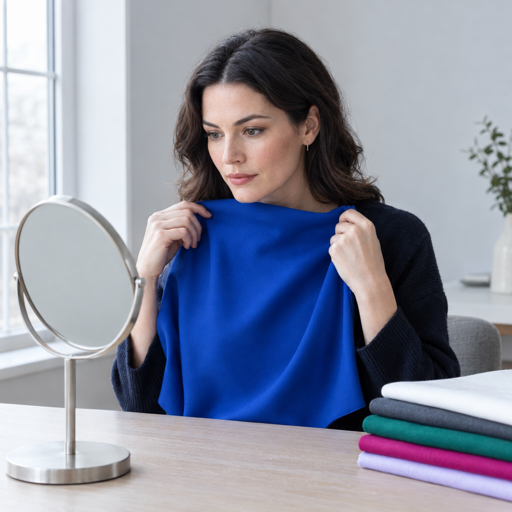
Fabric draping means placing colored material below your face and comparing its visual effect with another color. Existing shirts, scarves, pillowcases, or fabric pieces are enough to begin.
Keep the setup consistent
Use this checklist for every comparison:
- Light: face a window with indirect daylight, avoiding direct sun and warm indoor bulbs.
- Surroundings: choose a neutral background away from strongly colored walls or curtains.
- Hair: pull it away from your face. Cover dyed hair with a neutral cloth if its color distracts from the comparison.
- Makeup and accessories: remove strongly colored items where practical.
- Fabric position: cover the clothing at your neckline and hold each fabric directly below your face.
- Camera settings: turn off filters and beauty modes. Keep position, framing, white balance, and exposure consistent.
Compare in a mirror first. If you take supporting photographs, use the same camera position and exposure for both fabrics. Automatic camera adjustments can brighten one image or shift its warmth, making the comparison misleading.
Switch between fabrics, then describe the difference
Hold one color below your face, switch to the other, and repeat once. Use fabrics with similar texture and coverage where possible. Shiny cream satin versus matte white cotton introduces more than a color difference.
Look tentatively for three things:
- Complexion appearance: does your skin look relatively even, or does a particular area of color seem more noticeable?
- Feature definition: do your features remain distinct without the overall effect feeling harsh?
- Face-to-fabric balance: do you notice both together, or does the fabric attract nearly all your attention?
These are subjective visual impressions, not changes in your skin or health. A striking garment can also be exactly what you want, even if it dominates the outfit.
Record each pair as first color, second color, or unclear/no preference, with a short reason such as “navy felt balanced,” “cobalt drew attention away from my face,” or “both looked similar.” An unclear result is useful. There is no need to force a winner.
After these comparisons, Facefy’s Personal Color Analysis can offer an optional image-based estimate to consider alongside your observations. Lighting, white balance, makeup, and reflected color can influence the result, so treat it as another perspective rather than a definitive classification.
Four paired drapes that reveal color direction
These comparisons help you explore a direction. They do not isolate every color variable perfectly, so look for a pattern across several pairs.
1. Optic white versus cream
Compare a crisp, non-yellow white with a visibly creamy white.
- Optic white feels more balanced: supports a cooler, crisper direction associated with Winter.
- Cream feels more balanced: suggests exploring warmer palettes, including Spring or Autumn.
- Both feel too strong or too light: the useful distinction may involve softness or depth instead.
White fabrics can reflect considerable light toward your face. Keep their size and position similar.
2. Cobalt versus muted denim
Choose a clear cobalt and a gray-softened denim blue of reasonably similar depth.
- Cobalt works better: supports the clarity associated with Winter.
- Muted denim works better: suggests the softer direction of Summer, especially if other cool, muted shades also appear balanced.
- Unclear/no preference: clarity may not be the deciding quality, or the samples may differ too much in depth or texture.
If your denim sample is much lighter than the cobalt, you are comparing value as well as clarity. Note that limitation rather than attributing everything to saturation.
3. Blue-red versus tomato red
Use a red with a cool, slightly pink or blue character beside an orange-leaning red.
- Blue-red works better: supports a cool direction, potentially Winter.
- Tomato red works better: supports greater warmth, as found in Spring or Autumn.
- Unclear/no preference: try another cool-versus-warm pair before drawing a conclusion.
Try to keep both reds similar in depth and intensity. A dark cranberry and pale coral would answer a less specific question.
4. Charcoal versus warm camel
Compare a cool or neutral charcoal with a golden-brown camel.
- Charcoal works better: supports cool or neutral-cool depth.
- Camel works better: suggests an affinity with warmth, particularly Autumn when rich, muted colors also work.
- Unclear/no preference: neither temperature nor depth may be clearly dominant in this comparison.
This pair changes both temperature and depth, so it is a broad directional comparison rather than a precise undertone measure.
One preferred drape is not enough to establish a season.
A hypothetical record might look like this:
| Comparison | Observation |
|---|---|
| Optic white versus cream | Optic white made the complexion appear more even |
| Cobalt versus muted denim | Muted denim maintained better face-to-fabric balance |
| Blue-red versus tomato red | Blue-red preserved more feature definition |
| Charcoal versus camel | Unclear/no preference |
This combination suggests coolness but not consistent clarity. Comparing Cool Summer with Cool Winter would be more useful than forcing a Winter result. If later comparisons remain mixed, the label can stay unresolved while the individual successful colors become a personal palette.
Winter versus its neighboring seasons
Neighboring palettes share important qualities. That is why someone can respond well to colors from more than one season.
Cool Winter versus Cool Summer
Both emphasize coolness. The distinction is often clear and crisp versus soft and subdued.
Compare sapphire with smoky blue, or clear raspberry with muted rose. If the softer alternatives consistently make the complexion appear more even and maintain better face-to-fabric balance, Cool Summer may offer a better starting point.
Deep Winter versus Deep Autumn
Both accommodate depth. Deep Winter generally leans cooler and clearer, while Deep Autumn leans warmer and more muted.
Compare cool burgundy with warm oxblood, or blue-based deep green with dark olive. Someone with deep skin, hair, and eyes might respond more consistently to warm, rich, slightly muted drapes and find Deep Autumn more useful than Deep Winter. Depth alone does not settle the question.
Bright Winter versus Bright Spring
Both favor clarity. Bright Winter leans cooler, while Bright Spring introduces more warmth and often a lighter overall impression.
Compare vivid fuchsia with clear coral, or cobalt with a bright warm turquoise. If both work well, focus on the individual colors rather than treating the seasonal boundary as a prohibition.
When your coloring does not match the stereotype
A person with naturally light hair may still respond consistently to clear, cool Winter colors. Light hair should not automatically exclude the palette, just as dark hair does not establish it.
Hair color is only one part of your overall appearance, and the way your hair frames your face can also influence the visual effect of an outfit. If you’re considering a different haircut or styling approach, Facefy’s Hair Style Try-On lets you explore hairstyle options separately from your seasonal color comparisons. A hairstyle preview cannot determine your color season.
You may also sit between two Winter subtypes. If Cool Winter blues and Deep Winter burgundies repeatedly maintain complexion balance and feature definition, build a palette around both. Fabric comparisons are more informative than assumptions based on ethnicity, skin depth, or a particular hair-and-eye combination.
How to assess Winter neutrals, metals, and prints
Find dependable neutrals through comparison
Black, optic white, charcoal, cool navy, and cool gray are common Winter foundations, but you do not need all five. Compare the neutrals you wear most often near your face.
If black appears severe, try cool navy or charcoal. If optic white reflects too much light, test a slightly softer cool white rather than moving immediately to yellow cream. Neckline, fabric texture, and garment size can also change the result.
Choose metals by appearance, not category alone
Silver, white gold, and platinum-like finishes often echo the palette’s cool character. Brightness and surface finish matter too.
A pale, cooler-looking gold may feel more compatible than a strongly yellow, antiqued finish. Mixed metals can connect jewelry you already own. Compare the actual piece near your face rather than using jewelry preference as evidence of your season.
Assess prints by four qualities
The motif matters less than how the colors interact:
- Contrast: how different are the light and dark areas?
- Clarity: are the colors clean or gray-softened?
- Scale: does the print feel balanced at the garment’s size?
- Background: is the dominant color one you enjoy near your face?
A navy-and-white floral can be just as compatible with Winter as a geometric print. A large warm beige background may matter more than a few cobalt details.
Texture changes the effect as well. Velvet can make a shade appear deeper, while satin, sequins, and polished metal add reflected brightness. Judge the garment in ordinary light, not just from a flat color swatch.
How to wear camel, mustard, rust, peach, and dusty rose
A palette should help you combine clothes, not make favorite pieces unusable. Distance from the face, layering, and print balance offer practical flexibility.
| Color | Placement strategy | Concrete combination |
|---|---|---|
| Camel | Place it below the waist or separate it from the face with a cooler color | Camel coat with a cobalt scarf, or camel trousers with a cool navy knit |
| Mustard | Use it as a small accent or within a crisp print | Mustard bag with a black-and-white outfit |
| Rust | Keep it below the waist or combine it with cooler layers | Rust skirt with a charcoal top and blue-based teal layer |
| Peach | Use it in accessories or a print with cooler colors near the neckline | Peach bag with a navy outfit, or a printed blouse with fuchsia near the face |
| Dusty rose | Add depth or clarity with surrounding colors | Dusty rose top under a charcoal jacket with cranberry accents |
The same approach works for beige, orange, warm brown, and muted pastels. If you love one of these colors directly beside your face, you can simply wear it. Color harmony is one styling goal, not an obligation.
A ten-color Winter capsule in real outfits
A limited set of repeatable colors makes vivid accents easier to use.
Five neutrals: black, optic white, charcoal, cool navy, cool gray.
Five accents: cobalt, emerald, fuchsia, blue-red, icy blue.
Those ten colors support combinations such as:
- Charcoal trousers + optic white shirt + cobalt cardigan
- Black trousers + icy blue knit
- Cool navy suit + fuchsia top
- Cool gray skirt + emerald blouse
- Optic white jeans + blue-red sweater + cool navy coat
- Black dress + cobalt shoes + icy blue scarf
You can adjust contrast without replacing the whole palette:
- Lower contrast: cool navy trousers with a cobalt knit create a relatively tonal combination.
- Depth-led: black trousers, an emerald blouse, and a navy coat keep the outfit rich and dark.
- Crisp contrast: black trousers, an optic white shirt, and a fuchsia jacket create stronger separation.
Start with clothes you already own. Repeating the same neutrals across trousers, outerwear, and shoes makes a new accent easier to integrate than buying several unrelated statement pieces.
Winter makeup without relying on shade names
Makeup translates differently from fabric because it interacts with your natural lip and skin color, product opacity, and finish. Use the palette as a direction, then judge the product on you.
Lips
Explore blue-red, cranberry, raspberry, cool berry, fuchsia, and plum.
- Cool Winter: cooler, blue-based shades.
- Deep Winter: deeper cranberry, berry, and plum.
- Bright Winter: clearer reds and vivid pinks.
Intensity remains optional. A sheer cranberry balm and an opaque cranberry lipstick can produce very different effects while sharing a color direction.
Blush
Cool pink, rose, berry, and restrained plum are useful starting points. Choose depth and application strength for your complexion and preferred effect.
A pale cool pink may look chalky on some skin tones, while a deeper berry applied lightly may give a more natural-looking result. “Winter” does not mean that every cool pink will suit every wearer.
Eyes
Consider charcoal, cool taupe, navy, pewter, icy highlights, and selected jewel tones.
Cool Winter may favor blue-gray combinations, Deep Winter may prefer charcoal with deeper plum, and Bright Winter may suit a clean neutral base with vivid liner. There is no requirement to combine bright eyes, cheeks, and lips in one look.
Names such as “berry,” “plum,” “rose,” and “neutral” are inconsistent. Swatch where appropriate and assess the visible temperature, depth, and finish rather than trusting the name.
Allergies, irritation, comfort, workplace context, and personal style take priority over seasonal recommendations. Stop using a product that irritates your skin, regardless of how well its color fits the palette.
Common Winter typing mistakes
The most common shortcuts confuse a single feature or preference with a broader color pattern.
- Using vein color as proof. Vein appearance is affected by skin and lighting and does not reliably establish a seasonal palette.
- Equating dark hair with Winter. Dark hair occurs across seasonal categories, while light hair does not automatically exclude Winter.
- Relying on tanning response. How skin responds to sun exposure is not a dependable wardrobe-color guide.
- Treating jewelry preference as a result. Design, sentiment, finish, and personal taste all affect what you prefer.
- Deciding from one flattering color. A favorite cobalt shirt may work because of its cut, fabric, or styling as well as its hue.
- Comparing under warm bulbs or beside colored walls. Both can change the light reflected onto your face.
- Judging from photographs alone. Camera processing, filters, white balance, exposure, and screen settings can shift color.
- Forcing a subtype. Mixed results can become a useful personal palette rather than a problem to solve.
A calmer decision framework is to compare several color families, record the visible differences, choose a few useful shades, and wear them in everyday settings. Seasonal analysis is not a scientific diagnosis or a measure of how attractive you are.
Questions about the Winter color palette
Can Winter palettes include pastels?
Yes. Winter pastels are usually described as icy: very light, clean-looking pink, blue, lavender, or mint. They differ from dusty pastels softened with gray.
Retailers sometimes call both “pastel,” so compare the fabric rather than relying on the category. Some creamy or milky-looking shades may be warmer or softer than the icy effect you want.
Why do Winter palettes differ between systems?
Systems differ in terminology, subtype boundaries, and the physical swatches they use. A shade placed in Deep Winter by one system may sit near a neighboring palette in another.
Treat the shared qualities as the practical part: coolness, clarity, depth, and contrast. Exact membership is less important than whether a color works with the rest of your wardrobe.
Can someone have warm-looking skin and still be a Winter?
Within seasonal styling systems, yes. Surface skin color does not map neatly to one palette, and surrounding light can make skin appear warmer or cooler.
Repeated fabric comparisons are more useful than assigning a season from an apparent golden, pink, olive, or reddish surface tone. If the observations remain mixed, keep the colors that work and leave the seasonal label open.