DISCOVER YOUR BEST COLORS
Personal Color Analysis
Upload one selfie to discover the colors that complement your natural features. Explore your color palette, undertone, and seasonal color direction.


Use a clear, front-facing selfie with good lighting and your face fully visible.
How it works
How it works
- 01
Upload Your Selfie
Choose a clear, front-facing photo taken in natural or neutral lighting. For the most representative result, avoid strong filters or heavily colored lighting.
- 02
Explore Your Natural Coloring
Facefy considers visible characteristics such as your skin appearance, hair and eyes to explore the color directions that may complement your overall coloring.
- 03
Discover Your Color Palette
Explore your personal color direction and discover clothing, hair and styling colors you may want to try.
Guide
Discover the Colors That Suit You
Have you ever worn a color that instantly seemed to brighten your face?
And then tried another shade that looked beautiful on someone else but somehow felt completely different on you?
That is the idea behind personal color analysis.
Colors interact with the natural tones and contrast already present in your appearance. Two people can wear exactly the same shade of blue, red or green and create completely different visual effects.
Facefy's Color Analysis helps you explore which color directions may work particularly well with your visible coloring.
Instead of randomly choosing between hundreds of shades, you can start by understanding characteristics such as warmth, coolness, depth and contrast.
The goal is not to tell you which colors you are “allowed” to wear.
It is to give you a more useful starting point for choosing clothing, makeup, accessories and even hair colors.
What Is Personal Color Analysis?
Personal color analysis is a method of exploring how different colors interact with someone's natural appearance.
It typically considers visible characteristics such as skin tone, apparent undertone, natural hair color and eye color.

From there, colors may be grouped according to qualities such as:
- warm or cool,
- light or deep,
- bright or muted,
- high or low contrast.
You may also have heard of seasonal color analysis, where palettes are organized into categories such as Spring, Summer, Autumn and Winter.
These systems are useful because they transform thousands of possible colors into smaller families that share similar characteristics.
But your result should be treated as guidance rather than a restriction.
If your analysis points toward cool colors and you love warm orange, you can still wear orange.
Personal color analysis is about understanding visual effects, not creating rules about what belongs in your wardrobe.
Warm, Cool and Neutral Undertones
One of the most familiar ideas in color analysis is undertone.
Your visible skin tone describes how light, medium or deep your complexion appears, while undertone refers to the subtler color direction underneath that surface appearance.
Undertones are commonly described as warm, cool or neutral.
Warm undertones are generally associated with golden, peachy or yellow-leaning characteristics.
Cool undertones are more commonly associated with pink, rosy or bluish tendencies.
Neutral undertones sit somewhere between the two and may not lean strongly toward either direction.
However, real skin is more complex than three simple categories.
Lighting, camera settings, surrounding colors and even the screen you are viewing can change how skin color appears in a photograph.
That is why the quality of your photo matters considerably when performing color analysis online.
What Is Seasonal Color Analysis?
Seasonal color analysis organizes personal coloring into palettes inspired by the four seasons:
Spring, Summer, Autumn and Winter.
Each season represents a general combination of color characteristics rather than the literal colors associated with weather.
Spring palettes are generally associated with warmer, clearer and often lighter colors.
Summer palettes typically move toward cooler, softer or more muted shades.
Autumn palettes usually emphasize warm, earthy and deeper colors.
Winter palettes tend toward cooler, clearer and often higher-contrast shades.
Modern systems can divide these four seasons into additional subcategories, creating labels such as Soft Autumn, Deep Winter, Light Spring or Cool Summer.
The additional categories allow for more nuance because not everyone fits neatly into one broad seasonal description.
Spring Color Palette
Spring palettes generally combine warmth with brightness or lightness.
Depending on the specific Spring direction, colors may include warm coral, peach, fresh green, turquoise, warm pink and lighter golden neutrals.
The exact palette can vary considerably between different Spring subtypes.
Someone with a lighter overall appearance may prefer softer Spring colors, while someone with stronger natural contrast may gravitate toward clearer shades.
If your analysis suggests a Spring direction, you do not need to replace your entire wardrobe.
Start by testing colors near your face.
A shirt, scarf or top makes it easier to observe the relationship between a color and your complexion than trousers or shoes, which are farther from the face.

Summer Color Palette
Summer palettes generally emphasize cooler and softer color directions.
Rather than highly saturated or extremely warm shades, Summer palettes often contain muted blues, dusty pinks, lavender, softer greens and cool-toned neutrals.
The defining characteristic is not that every Summer color must be pale.
It is the overall relationship between coolness, softness and intensity.
Some Summer palettes are very light, while others can include deeper muted shades.
If bright colors tend to overpower your appearance but softer cool shades feel more harmonious, a Summer direction may be worth exploring.
Again, this should be treated as a styling tool rather than a rule.
You can still wear strong colors whenever you want the palette simply helps you understand why certain shades may create a different effect.
Autumn Color Palette
Autumn color palettes are generally associated with warmth, richness and earthy tones.
Typical directions may include olive, rust, terracotta, warm brown, mustard, deep teal and warm neutral shades.
Some Autumn palettes are softer and more muted, while others are considerably deeper.
The common thread is usually warmth combined with a less icy or blue-based appearance.
If your natural coloring has a warmer visual direction, these colors may create a particularly cohesive effect around your face.
This can also become useful when considering a hair-color transformation.
Copper, warm brunette, golden brown and other warm shades can interact differently with your complexion than cooler ash-based colors.
You can explore those possibilities separately with Facefy's Hair Color Try-On.
Winter Color Palette
Winter palettes generally combine coolness with clarity, depth or stronger contrast.
Depending on the subtype, this may include black, crisp white, jewel tones, deep blue, cool red, emerald and brighter cool shades.
Someone with naturally stronger contrast between their hair, skin and eyes may find that similarly clear or contrasting colors create an interesting visual harmony.
But not every Winter palette is identical.
A Deep Winter direction may emphasize darker colors, while another Winter subtype may work with brighter or cooler shades.
The value of identifying a general direction is that it gives you a focused group of colors to test instead of guessing randomly.
Can You Be Between Two Color Seasons?
Yes.
Not everyone fits perfectly into one broad seasonal category.
That is one reason expanded color-analysis systems use sub-seasons.
You may have characteristics associated primarily with one season while sharing qualities with a neighboring palette.
For example, your coloring might be warm like Autumn but relatively deep and high-contrast. Another person may be cool but softer and lighter.
Rather than becoming overly focused on finding one perfect label, pay attention to the underlying characteristics.
Do warmer or cooler colors tend to work better?
Do you prefer yourself in muted shades or saturated ones?
Does your appearance handle strong contrast well, or do softer combinations feel more balanced?
Those observations are often more useful than the name of the season itself.
What Colors Look Best on Me?
The answer depends partly on the visual effect you want.
Colors that closely complement your natural coloring can create a more harmonious appearance.
Colors that strongly contrast with your coloring can create a bolder effect.
Neither approach is inherently better.
Personal color analysis simply helps you understand the difference.
If you are building a wardrobe, knowing your color direction can also make shopping easier.
Instead of buying individual pieces that look good on their own but do not work together, you can gradually build around colors that coordinate naturally.
That can make it easier to combine tops, jackets and accessories without needing an entirely separate outfit for every occasion.

Your Hair Color Can Change Your Overall Contrast
Hair occupies a large area around the face, which means changing it can significantly affect your overall color balance.
Imagine someone moving from light blonde hair to deep brunette.
Even without changing their skin or eyes, the contrast around the face has changed considerably.
The same happens when moving between warm and cool hair colors.
Copper creates a different relationship with the complexion than ash blonde. Jet black creates a different level of contrast from medium brown.
This is why your natural coloring is a useful starting point, but it does not mean you can never move outside it.
If you are planning a color transformation, use Facefy's Hair Color Try-On to explore different shades before making the change.
You can then compare how warm, cool, light and dark colors affect your overall appearance.
Hair Color and Hairstyle Work Together
Color is only one part of the way hair frames your face.
The haircut itself changes where volume, length and movement appear around your features.
A dark chin-length bob creates a completely different frame from long blonde layers, even if both hairstyles are shown on the same person.
If you are considering both a new cut and a new color, it can be easier to explore them separately first.
Use the Hairstyle Finder to discover haircut directions that interest you.
Then experiment with the AI Hairstyle Try-On to visualize different styles.
Finally, use Hair Color Try-On to explore how different shades transform the complete look.
This helps you understand which part of the transformation you actually like rather than changing everything at once.
Does Eye Color Matter in Color Analysis?
Eye color can contribute to your overall coloring, but it should not be treated as the only factor.
Blue eyes do not automatically mean you belong to a cool palette.
Brown eyes do not automatically mean your coloring is warm.
The relationship between the skin, hair and eyes matters more than assigning a season from one feature alone.
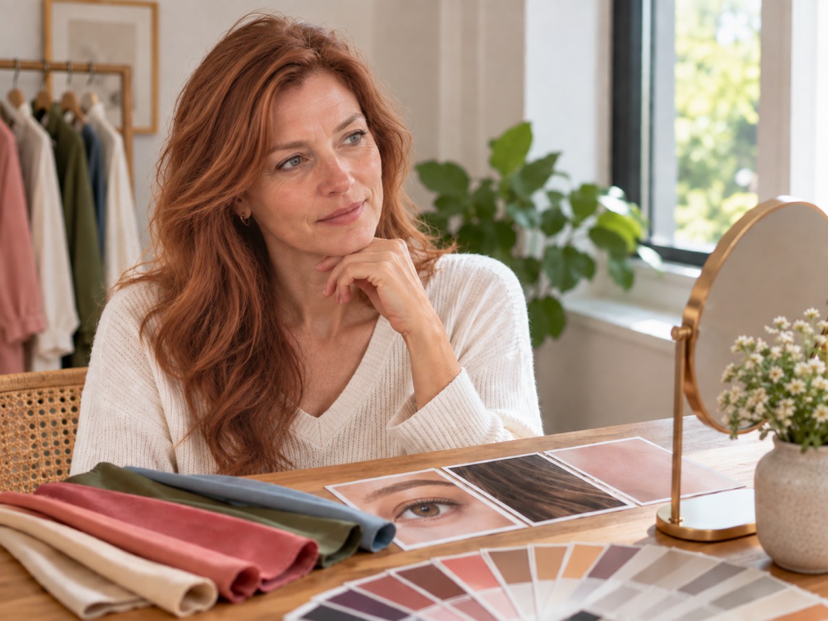
Eye color itself can also contain several tones.
Hazel eyes, for example, may contain combinations of brown, green and gold. Blue and green eyes can vary greatly in brightness and depth.
If you are curious about your eyes beyond their color, Facefy's Eye Shape tool explores their visible shape and structure separately.
Why Lighting Is Crucial for Color Analysis
Lighting is one of the most important factors when using a photo for color analysis.
A warm indoor bulb can add yellow or orange tones to your entire image.
Cool artificial lighting can shift colors in the opposite direction.
Strong shadows can also make some areas of the face appear darker or more saturated than they actually are.
Ideally, use soft natural daylight or neutral indoor lighting.
Avoid direct sunlight hitting only one side of your face.
You should also avoid colored LED lighting, strong filters and beauty effects that modify skin tone.
If the photograph significantly changes your natural coloring, the resulting analysis is naturally less representative.
A simple photo is usually better than a heavily edited one.
What Photo Should You Use for Personal Color Analysis?
Choose a recent, front-facing photo taken in neutral conditions.
Your face should be clearly visible, and the image should represent your coloring as naturally as possible.
For the best starting point:
- Use natural or neutral lighting.
- Face the camera directly.
- Avoid strong beauty filters.
- Avoid colored lighting.
- Keep your full face visible.
- Use a recent, sharp photograph.
- Avoid extreme overexposure or underexposure.
- If possible, avoid heavily tinted sunglasses or anything covering a large part of your face.
If you wear makeup every day, you can still explore your colors with makeup on.
However, if your goal is specifically to analyze your natural coloring, a photo with minimal makeup may provide a more neutral reference.
Personal Color Analysis Is a Guide, Not a Rulebook
Finding your color palette does not mean throwing away everything that falls outside it.
Personal style is personal for a reason.
You may love black even if another palette is considered more harmonious with your coloring.
You may prefer bright colors even when softer tones create a more subtle effect.
You may intentionally choose contrast rather than harmony.

Color analysis simply gives you another way to understand why different shades create different visual effects.
Use the result when it helps.
Ignore it when you prefer something else.
The most useful personal color palette is one that makes choosing colors easier without making personal style more restrictive.
Discover How Color Fits Into Your Overall Look
Your personal coloring is only one aspect of your appearance.
Hair, facial shape, eyes and proportions all contribute to the complete picture.
Once you have explored your Color Analysis, you can use Facefy's Hair Color Try-On to experiment with new shades or the Hairstyle Finder to discover cuts that may complement your features.
If you want to understand your facial structure more broadly, try the Face Shape Detector.
For a wider overview combining multiple facial characteristics, continue with Facefy's Face Report.
Your palette does not need to define your style.
It simply gives you a smarter place to start experimenting.
FAQ
Frequently asked questions
What is color analysis?
Color analysis explores how different colors interact with your visible natural coloring, including characteristics of your skin, hair and eyes. It can help identify color directions you may want to explore in clothing, makeup and hair.
What is seasonal color analysis?
Seasonal color analysis groups color palettes into Spring, Summer, Autumn and Winter, with many systems dividing those seasons into more specific subcategories.
How do I know what colors suit me?
Your visible undertone, overall coloring, contrast and the intensity of different shades can all influence how colors appear on you. Facefy's Color Analysis helps you explore those relationships from your photo.
What is the difference between warm and cool undertones?
Warm undertones generally lean toward golden, peachy or yellow characteristics, while cool undertones may appear more pink, rosy or blue-based. Neutral coloring may sit between the two.
Can I be between two color seasons?
Yes. Real coloring exists on a spectrum, which is why many systems use sub-seasons rather than only four broad categories.
Does eye color determine my color season?
No. Eye color can contribute to your overall coloring, but it should be considered alongside your skin and hair rather than used alone.
Can hair color change my color analysis?
Changing your hair color can significantly change the contrast and color balance around your face. You can explore different shades with Facefy's Hair Color Try-On.
What photo should I use for color analysis?
Use a recent, front-facing photo in natural or neutral lighting. Avoid strong filters, colored lights and heavily altered images.
Can I use a photo with makeup?
Yes, but makeup can modify visible skin coloring. If you want to explore your natural palette specifically, a photo with minimal makeup provides a more neutral starting point.
Do I have to wear only the colors in my palette?
No. Your palette is a styling guide, not a set of rules. You can wear any colors you like.
Can Facefy help me choose a complete new look?
Yes. After exploring your colors, you can use the Hairstyle Finder, AI Hairstyle Try-On and Hair Color Try-On to experiment with different parts of your look.
Discover the colors that flatter you most
Upload one selfie to explore your undertone, seasonal palette, and best everyday shades.
Analyze my colorsNo signup required · Your photo stays private