Color Analysis Quiz: Find Your Seasonal Color Palette
Take a color analysis quiz to estimate your season, understand your palette, and confirm the result with a simple at-home draping test.
This color analysis quiz estimates your seasonal palette by considering three qualities separately: temperature, depth, and chroma. Use indirect natural daylight, choose “unsure” whenever a difference is unclear, and treat the result as a starting point rather than a fixed classification.
You do not need a photo. A mirror and a few clothes or fabric swatches are enough to explore which colors you prefer near your face.
Take the color analysis quiz
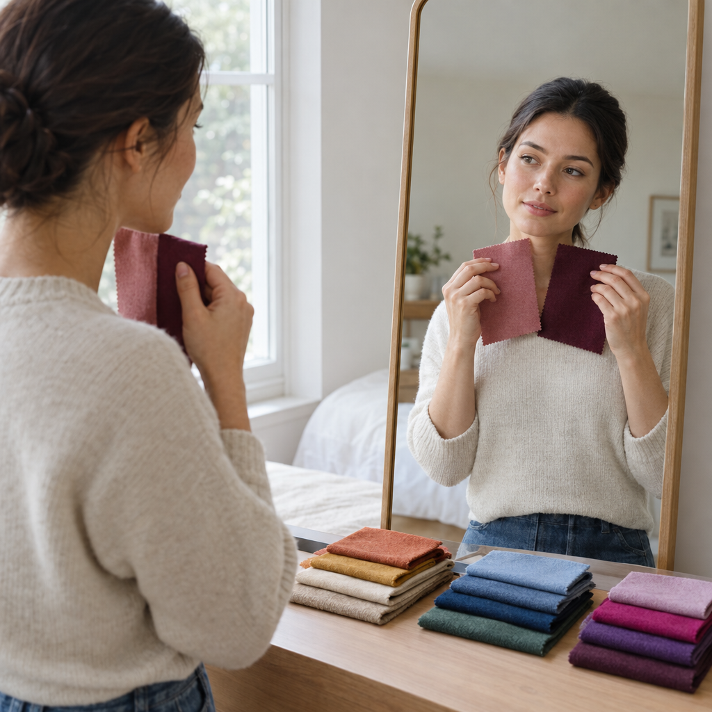
Face a window out of direct sunlight and use a neutral background. Remove makeup where possible, keep your position consistent, and pull dyed hair back if it distracts from the comparisons.
For each question, record A, B, or U for unsure/both. Compare real fabrics rather than imagining the colors. If you do not have a suitable pair, choose U instead of guessing.
Look for relative changes in facial definition, visible redness, and shadows. These are appearance observations, not signs of health.
Temperature: warmer or cooler colors?
Choose fabrics of similar depth and intensity wherever possible. If this concept is unfamiliar, this guide to warm and cool undertones explains how temperature is used in color analysis without treating it as a rigid rule.
1. Compare warm cream with cool white.
- A: I prefer the warmer cream.
- B: I prefer the cooler white.
- U: Both, neither, or unsure.
2. Compare warm beige with cool gray of similar depth.
- A: I prefer warm beige.
- B: I prefer cool gray.
- U: Both, neither, or unsure.
3. Compare peach-pink with blue-based rose of similar intensity.
- A: I prefer peach-pink.
- B: I prefer blue-based rose.
- U: Both, neither, or unsure.
Depth: lighter or deeper colors?
Keep temperature and intensity reasonably similar.
4. Compare light blue with a deeper blue.
- A: I prefer the lighter blue.
- B: I prefer the deeper blue.
- U: Both, neither, or unsure.
5. Compare pale rose with deep rose.
- A: I prefer pale rose.
- B: I prefer deep rose.
- U: Both, neither, or unsure.
6. Compare light gray with charcoal.
- A: I prefer light gray.
- B: I prefer charcoal.
- U: Both, neither, or unsure.
Chroma: clearer or softer colors?
“Clear” means relatively saturated, while “muted” means softened or grayed. Avoid comparing a pale muted fabric with a much darker clear one. Color contrast is related to chroma but is not identical; this guide to contrast in personal color analysis provides additional context.
7. Compare clear blue with smoky blue.
- A: I prefer clear blue.
- B: I prefer smoky blue.
- U: Both, neither, or unsure.
8. Compare clear rose with dusty rose.
- A: I prefer clear rose.
- B: I prefer dusty rose.
- U: Both, neither, or unsure.
9. Compare clear green with softened green.
- A: I prefer clear green.
- B: I prefer softened green.
- U: Both, neither, or unsure.
How your quiz answers lead to a result
Keep three separate tallies. U adds no points. Within each group, two or three answers on one side support that direction.
| Questions | Two or more A answers | Two or more B answers |
|---|---|---|
| 1–3: Temperature | Warm | Cool |
| 4–6: Depth | Light | Deep |
| 7–9: Chroma | Clear | Muted |
A 3–0 result is consistent. A 2–1 result supports a direction but contains conflicting evidence, while two matching answers and one U provide incomplete but still useful evidence.
If neither side receives two answers, mark that axis as unresolved. Balanced observations may eventually suggest neutral temperature, medium depth, or balanced chroma, but unanswered questions alone do not establish those qualities.
Find your seasonal shortlist
Use your supported directions to build a shortlist:
- Warm: Spring or Autumn
- Cool: Summer or Winter
- Light: Spring or Summer
- Deep: Autumn or Winter
- Clear: Spring or Winter
- Muted: Summer or Autumn
When all three directions point to one season, that season is your leading result. If only one axis has enough evidence, keep the two seasons associated with that direction.
For example, two warm answers and seven unsure answers support Spring and Autumn with a mixed confidence level. The answers do not identify one season, but they provide more information than an empty result. If no axis receives two matching answers, there is not yet enough evidence for a shortlist.
Vein color, jewelry preference, and tanning behavior receive no points here because each can be influenced by factors unrelated to undertone. Direct fabric comparisons are more useful when the lighting and other conditions stay consistent.
Spring result: warm, light, or clear color qualities
Spring is worth exploring when warm colors work well alongside lighter or clearer shades.
- Neutrals: warm ivory, camel, warm navy
- Accents: coral, peach, warm turquoise, leaf green, clear golden yellow
- Closest comparison: Autumn, using clearer versus softer warm colors
Treat these suggestions as experiments rather than a shopping list. If you are also considering lighter hair, how to know if blonde hair will suit you separates shade harmony from achievable lift, hair condition, and maintenance.
Summer result: cool, light, or muted color qualities
Summer emphasizes cool or neutral-cool shades with softened intensity, often at light-to-medium depth.
- Neutrals: soft white, cool taupe, slate blue
- Accents: dusty rose, lavender, soft berry, muted blue-green, muted periwinkle
- Closest comparison: Winter, using softened versus clearer cool colors
People with deeper skin tones can receive a Summer result. Seasonal names describe relationships among colors, not complexion categories.
Autumn result: warm, deep, or muted color qualities
Autumn is worth exploring when warmth combines with deeper or softer colors.
- Neutrals: cream, olive-brown, warm charcoal
- Accents: rust, moss green, teal, mustard, warm burgundy
- Closest comparison: Spring, using muted versus clearer warm shades
Notice which combinations you enjoy instead of assuming that every earthy color must produce the same effect.
Winter result: cool, deep, or clear color qualities
Winter emphasizes cool or neutral-cool shades with greater depth or clarity.
- Neutrals: optic white, charcoal, cool navy
- Accents: cobalt, emerald, fuchsia, cool red, icy violet
- Closest comparison: Summer, using clearer versus softened cool shades
Clear does not have to mean neon. A saturated navy may feel more comfortable than a vivid accent while still preserving clarity.
Confirm your result with a five-minute draping check
Use a makeup-free face in indirect natural daylight. Keep the background, mirror position, and distance from the window the same throughout the check.
Compare three pairs:
- Warm versus cool: cream versus cool white, or warm beige versus cool gray.
- Light versus deep: two blues or roses with similar temperature and saturation.
- Clear versus muted: clear blue versus smoky blue at approximately the same depth.
Hold each fabric directly beneath your face and cover competing clothing colors. Switch between the two fabrics rather than placing them side by side.
Watch for repeatable changes in shadow definition, visible redness, and how clearly your features stand out. Also notice whether your attention goes first to your face or the fabric. No single observation is a universal pass-or-fail rule.
Repeat the least certain pair. If the difference remains subtle, leave that axis unresolved and try again on another day rather than forcing an answer.
After this check, Facefy’s Personal Color Analysis offers an optional photo-based second perspective. Lighting, camera white balance, exposure, makeup, and filters can affect the estimate, so compare it with your observations rather than treating it as the deciding vote.
What to do with mixed or neutral clues
- Neutral undertones: Give repeatable fabric responses more weight than a close tally. Borrowing from neighboring palettes is reasonable. If you are distinguishing similar undertones, the differences between neutral and olive undertones may provide useful context.
- Dyed hair: Pull dyed lengths back when exploring your natural coloring. Include the dyed color when coordinating the appearance you currently wear.
- Gray or white hair: Assess your present appearance instead of trying to reconstruct an earlier palette.
- Freckles: Freckles do not automatically indicate warmth. Compare the overall effect of the fabrics.
- Facial redness: Separate temporary surface redness from preferences that repeat across several comparisons.
- Deeper skin tones: Assess temperature, depth, and chroma independently. Skin depth alone cannot assign a season.
Mixed signals do not make the quiz unsuccessful. They may indicate that neighboring palettes both contain useful colors. Seasonal palettes can also be applied flexibly as your hair color, styling preferences, or wardrobe changes; this overview of whether a seasonal color palette can change explains that distinction.
How to use your confidence level
These labels describe answer consistency, not statistical accuracy.
- Clear match: Every axis has three consistent answers, and all three directions align with one season.
- Possible match: Every axis has a supported direction pointing to one season, but at least one axis includes an unsure or opposing answer.
- Mixed result: One or more axes are unresolved, or the supported directions do not align neatly with one season.
Choose the next comparison based on the evidence that needs clarification:
- Recheck an unresolved axis if it prevents you from narrowing the shortlist.
- Recheck a 2–1 axis because it contains conflicting observations.
- Recheck a two-matching-plus-U axis before revisiting a unanimous one.
- If every axis is unanimous but the directions do not align, compare the quality creating the mismatch.
For example, two warm answers plus one unsure, three light answers, and three clear answers suggest Spring—possible match. The next useful step is another warm-versus-cool comparison because temperature is incomplete. There is no reason to repeat the unanimous chroma comparison first.
Match the test to the uncertainty. Warm-versus-cool fabrics investigate temperature, while clear-versus-muted fabrics investigate chroma. A Spring-versus-Autumn comparison should focus on depth or chroma because both are warm seasonal families.
What a color analysis quiz can—and cannot—tell you
Seasonal color analysis is a styling framework, not a medical assessment or permanent biological classification. This quiz organizes visual preferences; it does not measure health, age, attractiveness, or ethnicity.
The four-season system provides broad starting points. Twelve-season systems add categories such as Light Spring, Soft Summer, Deep Autumn, and Clear Winter, but subtype definitions can vary. Mixed evidence is a reasonable reason to remain with a broader seasonal family.
Makeup, hair dye, colored contacts, surrounding wall colors, and lighting can change visual judgments. Photos introduce additional variables such as exposure, white balance, filters, and screen settings.
Color analysis quiz questions, answered
Can I have a neutral undertone or fit two seasons?
Yes. Close results can reflect neutral coloring, subtle visual differences, or uncertain comparisons. Keep both palettes and compare the qualities that distinguish them.
Should I use natural or dyed hair?
Use natural features when exploring your natural coloring. Include dyed hair when choosing colors to coordinate with the appearance you currently wear.
Can people with dark skin be Spring or Summer?
Yes. Complexion depth does not determine temperature, chroma, or seasonal family. Each quality should be considered independently.
Are jewelry and vein checks reliable?
They are weak supporting clues. Lighting, metal finish, vein visibility, and personal preference can complicate them, so direct fabric comparisons deserve more weight.
Do I need a photo?
No. A mirror in indirect daylight is enough. A photo-based analysis can provide another perspective, but it should not override consistent real-life fabric comparisons.