Color Analysis: Find Your Best Colors Beyond Seasonal Labels
Learn how color analysis uses temperature, value, chroma, and fabric draping to build a flexible palette without rigid seasonal rules.
Personal color analysis compares how colors placed near your face interact visually with your complexion, eyes, and hair. The most useful approach considers temperature, value, and chroma separately, then looks for recurring preferences through side-by-side fabric draping.
A color season can summarize those preferences, but it is not a biological category, a measure of attractiveness, or a rule about what you may wear. You can build a useful palette without deciding that you are definitively a Spring, Summer, Autumn, or Winter.
What personal color analysis can tell you
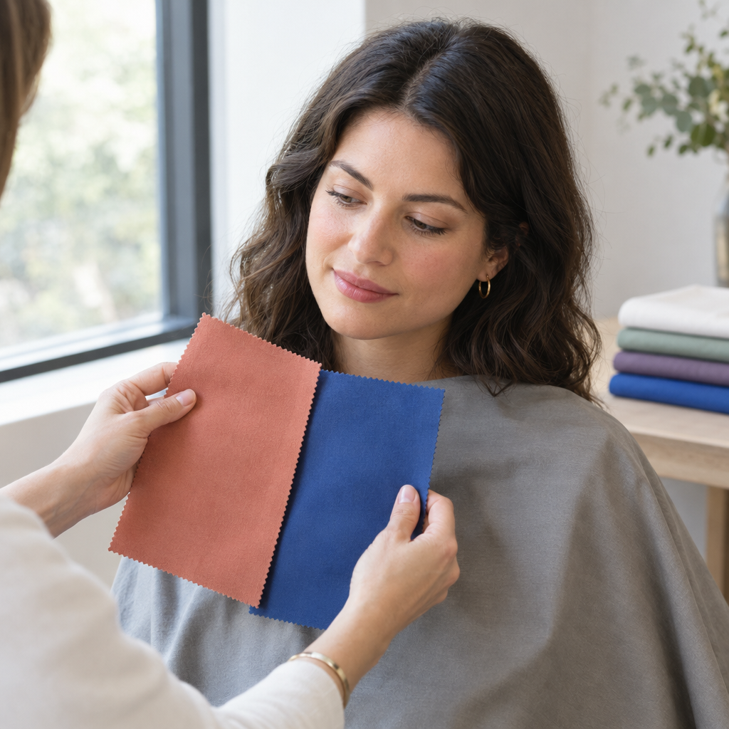
Color analysis is an optional styling method for finding colors that create a preferred sense of harmony, contrast, or definition around your face. It can help narrow choices for clothing, scarves, glasses, jewelry, and makeup.
For example, you might find that moderately muted blues are easier to wear than either very pale blue or electric blue. That observation gives you a practical shopping direction, even without a seasonal label.
The judgments remain partly subjective. One person may prefer a subtle, blended effect; another may enjoy a striking contrast between their clothing and complexion. Neither preference is wrong.
Color analysis cannot determine health, ethnicity, personality, attractiveness, or personal worth. Nor does skin depth identify a palette: two people with similarly fair, medium, or deep complexions may prefer quite different color combinations.
The three color characteristics that matter most
Instead of asking “What season am I?” immediately, start with three separate questions.
| Characteristic | What it describes | Useful comparison |
|---|---|---|
| Temperature | Warmer versus cooler color lean | Peach versus cool pink |
| Value | Lightness versus darkness | Light blue versus deep blue |
| Chroma | Mutedness versus vividness | Dusty blue versus clear blue |
Temperature: Does a warmer or cooler version of a color create the effect you prefer? Compare peach with cool pink at roughly the same lightness and intensity. If one fabric is also much brighter, you cannot confidently attribute the difference to temperature alone.
Value: Do lighter, medium-depth, or deeper colors work more consistently? Compare light and deep versions of a similar blue, keeping their warmth and intensity as similar as possible.
Chroma: Do softened or vivid colors work more consistently? Compare dusty blue with a clearer blue of similar lightness and temperature. Muted colors have a grayer appearance; vivid colors look more intense. These are established color-description terms, although personal palette judgments remain interpretive.
Fabric names are not standardized. “Rose” may describe a soft, cool pink in one shop and a warmer, brighter shade in another. Judge the actual swatches, not their names.
Where contrast fits
Contrast describes the difference between colors worn together. A pale shirt under a dark jacket creates stronger light-dark contrast than a medium-blue shirt under a navy jacket.
It matters when assembling outfits, but it does not replace the three characteristics above. You might prefer cool, deep, moderately muted colors and still enjoy an occasional high-contrast combination. You do not have to match your clothing contrast exactly to the contrast between your skin, hair, and eyes.
Undertone is not the same as skin depth or surface color
In beauty and styling language, undertone refers to a relatively stable warm, cool, or neutral quality perceived beneath surface coloring. Olive is another complexion descriptor, often used for a greenish or grayish cast, and it can overlap with warm, cool, or neutral impressions.
Overtone describes the visible surface color. Tanning, redness, pigmentation, and temporary changes can influence what you see without necessarily changing your broader palette preferences.
Keep these distinctions in mind:
- Depth is separate from undertone. Fair, medium, and deep complexions can each have warm, cool, neutral, or olive characteristics.
- Visible redness does not automatically mean cool undertones. It is one aspect of surface appearance.
- Olive is not synonymous with warm. Surrounding colors and lighting may bring out warmer, cooler, greenish, or grayish impressions.
- Neutral does not mean every color works equally well. Lightness or intensity may matter more than warmth.
Vein color, jewelry preference, eye color, and natural hair color provide limited clues on their own. Lighting affects how veins appear; jewelry varies in finish and brightness; and the same eye or hair color can occur alongside different complexions. A recurring response to several fabrics is more useful than one shortcut.
How four-season and 12-season systems organize palettes
The four-season system groups palettes by broad combinations of color characteristics.
| Season | Common temperature lean | Common palette character |
|---|---|---|
| Spring | Warmer | Clearer, often lighter |
| Summer | Cooler | Softer, often lighter |
| Autumn | Warmer | Muted, often earthy or deep |
| Winter | Cooler | Clear, often deep or contrasting |
These are descriptions of palettes, not instructions for assigning people by ethnicity, hair color, or eye color.
The 12-season system divides each season into three subgroups. Depending on the system, names highlight a dominant quality such as light, deep, bright, soft, warm, or cool. “Soft Summer,” for instance, emphasizes muted colors within a generally cool palette.
Names and boundaries vary between analysts. More categories can provide nuance, but they are not automatically more useful. If “neutral-cool, medium-to-deep, and softly saturated” helps you choose clothes, that description may serve you better than a season that only partly fits.
How to compare colors with side-by-side fabric draping
Draping means holding fabric near your face and observing its visual effect. You can use existing tops, scarves, pillowcases, or fabric remnants. Similar fabric textures are helpful because a glossy satin and a matte cotton reflect light differently.
1. Keep the surroundings consistent
Use this simple setup:
- Sit in indirect daylight, away from direct sun and strongly colored walls.
- Choose a neutral background.
- Use clean skin or minimal makeup so you can see your usual coloring.
- Cover strongly dyed hair with a neutral cloth if you want to isolate the complexion.
- Remove tinted glasses and, if practical and safe, colored contact lenses.
- Keep your mirror, position, and distance from the light unchanged.
You can later uncover your hair and put your usual glasses back on to assess the complete look.
2. Compare these six pairs
Hold each fabric just below your chin, covering much of your upper chest. Switch between the two several times rather than studying either one in isolation.
| Pair | What to compare | Important limitation |
|---|---|---|
| Warm white versus cool white | A gently creamy white and a cooler white of similar brightness | Some whites differ in brightness as well as temperature |
| Camel versus charcoal | Warm tan versus cooler dark gray | Usually changes value too |
| Tomato red versus blue-red | An orange-leaning red and a cooler red | Match depth and intensity as closely as possible |
| Peach versus cool pink | A warmer and cooler light color | Keep lightness and softness similar |
| Olive versus blue-green | Warmer and cooler green families | Choose similarly deep, similarly muted fabrics where possible |
| Soft navy versus vivid cobalt | Restrained versus intense blue | Cobalt may also be lighter, so add a muted blue of similar lightness if needed |
These are useful starting pairs, not perfectly isolated comparisons. When two fabrics differ in several ways, the result tells you which whole color you prefer, not necessarily why.
3. Judge the face, not your favorite fabric
Look for four signals:
- Shadows: Do shadows beneath the eyes, beside the nose, or below the mouth appear stronger or softer?
- Redness: Does existing redness look more prominent or less noticeable?
- Feature definition: Do your eyes, lips, and brows remain distinct, or does the fabric seem to dominate?
- Complexion evenness: Does the overall complexion appear more even, or do differences in surface color stand out more?
These are changes in visual perception, not changes in your skin. Reflected color from the fabric may also contribute.
No single signal decides the result. A bright fabric might make your eyes stand out while also making redness more noticeable. Record that trade-off instead of forcing a winner.
4. Keep a short comparison record
Use one line per pair:
Pair: Peach / cool pink Preferred effect: Cool pink Observed: Redness less prominent; features similarly distinct Interpretation: Possible cool preference; compare other pairs
After all six pairs, write three provisional notes:
- Temperature: Warmer, cooler, mixed, or unclear.
- Value: Lighter, medium, deeper, or unclear.
- Chroma: Muted, moderate, vivid, or unclear.
If you have only compared camel with charcoal, value is still uncertain. Add light and deep versions of a similar hue before concluding that darker colors consistently work better.
What mixed or conflicting results may mean
Mixed results do not mean you have done something wrong. Use the clearest recurring pattern rather than trying to make every comparison agree.
| Recurring observation | Possible interpretation | Useful next comparison |
|---|---|---|
| Warm and cool remain close | Neutral temperature preference | Same hue, different depths |
| Deep colors repeatedly work better | Value may lead | Deep warm versus deep cool |
| Muted colors repeatedly work better | Chroma may lead | Muted warm versus muted cool |
| Temperature results remain inconsistent | Multiple variables may matter | Better-matched fabric pairs |
For more specific situations:
- Both warm and cool colors work: You may have a neutral temperature preference, or temperature may simply matter less than depth and intensity.
- You describe your complexion as olive: Some warm colors may emphasize yellowish impressions, while some cool colors may emphasize grayish ones. Compare muted and clear versions at similar depth. Conflicting results alone do not establish an olive undertone.
- Light versus deep gives the strongest difference: Prioritize value. A deeper warm shade and a deeper cool shade may both work better than their pale equivalents.
- Soft versus vivid gives the strongest difference: Prioritize chroma. Explore your preferred intensity across several color families before narrowing temperature.
A characteristic-led palette such as neutral, deep, and moderately muted is a complete, usable outcome.
Online quizzes often disagree because they use different category boundaries or infer several traits from limited answers. A quiz based mainly on hair and eye color may miss the fabric responses that matter most to you.
Why photo-based color analysis can give different answers
A photograph records both your coloring and the camera’s interpretation of the scene.
Automatic exposure can make one image lighter than another. Automatic white balance can shift apparent warmth as the camera responds to colors in the frame. Phone processing, portrait modes, filters, compression, and screen settings may change contrast or saturation. Colored curtains, walls, and furniture can also reflect color onto your face.
A repeat-image consistency check
An A-B-A sequence can reveal whether the image changes over time:
- Photograph drape A using consistent daylight, background, camera position, distance, and framing.
- Photograph drape B without changing your setup.
- Photograph drape A again.
- Compare the two A images and inspect the neutral background across all three images.
Matching A images are useful as a temporal drift check. They suggest that the setup returned to a similar appearance, but they do not prove that the A-to-B comparison was captured consistently.
The camera may alter exposure or white balance in response to drape B, then return to its original setting when drape A reappears. For example, both A images might match while the neutral background becomes cooler or darker in B. That background change suggests a capture adjustment rather than a dependable draping effect.
Where your camera allows it, use fixed exposure and a fixed white-balance setting for the full sequence. Keep filters off and processing settings unchanged. If fixed controls are unavailable, treat background changes as a reason to repeat the comparison or rely more heavily on a mirror-based assessment.
Consistent images are more useful, but consistency alone does not guarantee faithful color. The A-B-A check tests drift over time; checking the background across A, B, and A helps reveal adjustments triggered by the different drapes.
Facefy’s Personal Color Analysis can offer a photo-based estimate to help you compare palette directions with your draping observations. Treat it as a starting suggestion, not a replacement for controlled fabric comparisons. Use only photos you have permission to upload.
Can tanning, graying, or hair dye change your color season?
These changes can affect which combinations you enjoy without proving that your underlying complexion has switched categories.
Tanning changes surface depth and contrast
A tan can deepen visible skin color and alter the contrast between your complexion, hair, and clothing. Some pale or deep colors may therefore feel different than they did before.
You can adapt your working palette to your current appearance without assuming a permanent undertone change. There is no need to tan for color analysis.
Graying changes the balance around your face
As hair becomes gray or white, its depth and intensity change. This may alter overall contrast and make different clothing values or intensities feel more balanced.
The direction is individual. Graying does not automatically mean you need softer colors, cooler colors, or a different season.
Dyed hair introduces a different surrounding color
Hair dye changes the color framing your complexion. A copper shade, an ash-brown shade, and a vivid fashion color can each create different relationships with clothing. If you’re considering a new shade, Facefy’s hair color try-on can help you preview different hair colors before committing to a change.
Compare fabrics with your hair covered if you want a complexion-focused view, then uncovered if you want guidance for your current style. Both questions are useful.
Makeup, self-tanner, glasses, and colored contact lenses can similarly influence the overall impression. A palette should support how you actually present yourself, not require you to maintain one appearance indefinitely.
How to turn your results into a practical wardrobe palette
Start with the colors that repeatedly worked well, not a shopping list for an entire season. Your results are a planning aid, not a requirement to replace your wardrobe.
1. Prioritize items close to your face
Use your preferred colors first for tops, scarves, collars, jackets, glasses, earrings, and necklaces. These pieces create a frame around your face shape and have the most direct effect on the color interactions you observed during draping.
For glasses and jewelry, consider brightness and finish as well as hue. Shiny silver and brushed silver do not create the same visual effect.
2. Place less-preferred colors farther away
If you enjoy a color but prefer another near your face, use it in trousers, skirts, shoes, or bags.
A mustard skirt with a preferred blue top, for example, lets you combine both colors without asking mustard to frame your complexion.
3. Use layering before replacing clothes
Try a preferred scarf, open jacket, contrasting collar, or visible neckline layer with an existing garment that feels less harmonious. Prints can also connect different parts of an outfit by including one or two shades you already enjoy near your face.
4. Build a compact starter palette
Choose:
- Two neutrals for easy combinations.
- Three main colors for tops and layers.
- One accent for variety.
Someone whose comparisons suggest cool, medium-to-deep, moderately muted colors might begin with charcoal, soft navy, slate blue, muted teal, berry, and a restrained rose accent. That is an example, not a prescription.
For makeup, compare color families in consistent light and assess the finished look. Lip pigmentation, coverage, texture, and the rest of your makeup can change how a shade appears.
Personal taste, dress codes, cultural context, and creative expression can all take priority. Color analysis should make dressing easier, not make your wardrobe smaller.
When professional draping may help
Professional draping may be useful if your home comparisons remain inconclusive or you want a broader set of colors to work from.
A session typically involves a larger fabric range and controlled surroundings, with distractions from makeup, hair, and nearby colors reduced. It can be particularly helpful when:
- Warm and cool comparisons remain close.
- Olive characteristics make simple temperature labels unhelpful.
- Value or chroma appears more influential than temperature.
- Photo-based assessments repeatedly disagree.
Bring your comparison notes and examples of colors you enjoy. Ask the analyst to show which differences support their recommendation and how to translate them into everyday outfits.
A professional opinion still involves visual interpretation. A useful session should explain your options and respect your preferences, not make a seasonal label feel compulsory.
Common questions about color analysis
What if both warm and cool colors suit me?
You may prefer relatively neutral colors, or lightness and intensity may matter more than temperature. Look for shared characteristics among your successful colors instead of choosing warm or cool by default.
Is gold versus silver a reliable undertone comparison?
It is one clue, not a deciding method. Finish, brightness, reflectivity, size, and nearby clothing affect the comparison. Try pieces of similar size and finish, then compare the result with your fabric observations.
Can two people with the same skin tone have different color seasons?
Yes. If “same skin tone” means similar complexion depth, that does not establish the same undertone or the same response to light, deep, muted, and vivid colors. Overall coloring also differs.
Is the four-season or 12-season system better?
Use whichever describes your recurring preferences without forcing a poor fit. Four seasons may offer enough direction; 12 seasons may capture useful distinctions. A palette described by temperature, value, and chroma is also valid.
Why do online quizzes give different results?
They ask different questions, use different assumptions, and draw category boundaries differently. Photo-based versions also inherit lighting and camera limitations. Give more weight to recurring fabric comparisons than to agreement on a label.